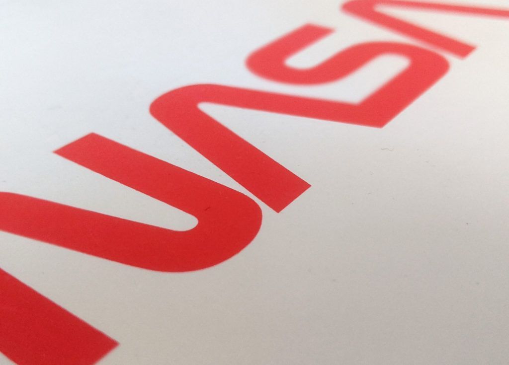
Most of us are familiar with the classic NASA logo, that iconic patch of blue that has become an indelible part of history as well as pop culture. However, in 1975, the “meatball”, as it is popularly known, was replaced by a new, sleeker logo: the worm.

Why the change? According to NASA, the meatball “was a difficult icon” for 1970s technology to print and reproduce, as well as “a complicated metaphor in what was considered, then, a modern aerospace era.” Under the Nixon administration, the agency was under pressure to reduce its focus on space exploration and instead concentrate on developing technology with potential commercial applications — hence the simplification of the logo and the decision to eliminate any space-related imagery from it. It was in these conditions that the worm was born, the brainchild of New York-based graphic designers Richard Danne and Bruce Blackburn, who were, at that point, young and relatively inexperienced.

Visually, the two are very different. One is a wealth of detail, featuring stars, planets, and spacecraft and decked out in patriotic red, white and blue. The other is a series of curved red lines set starkly against a white background; strikingly modern, compared to its predecessor. As NASA’s chief historian, Bill Barry, notes, the decision to use only letters was intentional “because NASA could then be anything you wanted it to be, including not a space agency.”
Given this, it is perhaps unsurprising that the worm was never particularly popular within NASA. This was not helped by the fact that most people only discovered that the logo was being changed when they received new stationery from company headquarters. For many employees, and indeed many members of the public, the meatball was a familiar, comforting symbol, one that clearly showcased the mission of the agency and was closely associated with NASA’s greatest achievements up to that point. The worm, meanwhile, comes from a completely different design universe; and while there is no doubt that it is much more impressive from a branding standpoint, most people within NASA either didn’t consider that to be important or remained loyal to their beloved meatball.
Despite the fact that the worm was relatively short lived (it was retired in 1992 by a NASA administrator who absolutely detested it), it has had a lasting influence on graphic design, not least because of the NASA Graphics Standards Manual. This list of guidelines developed by the design firm who created the logo laid out the rules for how NASA’s branding should be depicted on everything from its spacecraft to its memos. Thanks to its exhaustive detail, this manual has become an important resource for graphic designers looking to create an entirely new visual system for a brand, and the hand-drawn logo itself has become revered by design enthusiasts.
Come May 27th, the worm will have its day in space again on the next crewed space flight to the International Space Station.
While its future is uncertain – NASA says it’s “still assessing how and where it will be used” – there is no doubt that for a whole generation of people, the worm is what defines NASA. Who knows, maybe the worm will take over mission control from the meatball once more…